 HUM IMAGES/GETTY IMAGES
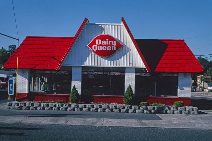
DQ’s logo may have started out plain and simple at first, but it didn’t last long. By 1960, the logo with a blue background was completely transformed into a closer version of what we see today. The bright red shape resembled a pair of lips, with a white font spelling out ‘Dairy Queen’ in the center. That logo held on strong for more than 40 years before the text was simplified in 2001.
The 2001 logo swap followed after many custo
Continue reading…